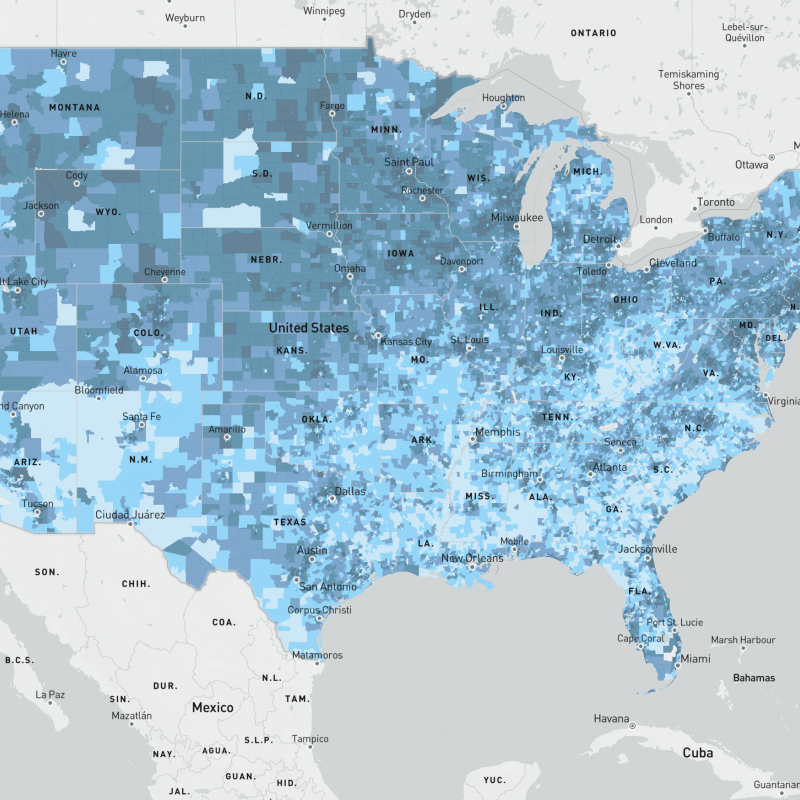
We’re delighted to share a new interactive mapping application that gives community leaders and policymakers tools to “build back better” as we emerge from the pandemic and create conditions for all children to thrive. The Child Opportunity Index measures and maps the conditions children need: safe housing, good schools, access to healthy food, green spaces and clean air, among others. These conditions are not equitably available to all children in the U.S. Black, Hispanic and Indigenous children disproportionately live in neighborhoods that do not provide all the conditions children need to be healthy and grow into their full potential. The new map application allows users to visualize the distribution of child neighborhood opportunity across the country and explore data for virtually every census tract in the U.S.
What’s new?
For the first time, users are able to visualize the data underlying the Child Opportunity Index for 72,000 census tract in the U.S. Users can explore the overall Index or dig into 29 indicators across three sub-indices: Education, Health and Environment and Social and Economic. Users can also see where children of different racial/ethnic groups live in relation to opportunity, compare opportunity levels nationally, within states or within metropolitan (metro) areas, and explore two time points (2010 and 2015) to understand change over time or set benchmarks to track progress.
Using the interactive maps
The new map app is a valuable tool for community leaders, policymakers and individuals to use as they grapple with the longstanding racial and ethnic inequalities in health and opportunity exposed by the COVID pandemic. The interactive maps can help communities understand existing patterns of child opportunity and identify which neighborhoods already provide the conditions children need to thrive and which areas need additional investment. The maps can serve as a starting point for conversations about how to ensure that child opportunity is distributed equitably across an entire community. They can be used for planning how to allocate resources to achieve an equitable recovery that allows all children to have access to the conditions they need to thrive. And they can be used for storytelling to engage communities and activate change. Below we highlight some of the app’s functionality.
Compare a location to others in a metro, state or the nation
The Child Opportunity Index allows users to compare neighborhoods, but it’s important to make sure we’re comparing apples to apples. To compare neighborhoods within one metro area, use metro normed metrics. To compare neighborhoods within one state, use state normed metrics. For all other comparisons, use nationally normed metrics. Why does this matter? Because there is so much variation in levels of opportunity across the U.S., a neighborhood (census tract) in Hartford, CT might score differently depending on what it's being compared to. The same census tract could be high opportunity compared to the nation, but moderate or low opportunity compared to others in the Hartford metro area, which has very high overall levels of opportunity. For the first time, users can visualize these differences by toggling between three differently normed data sets, using the “compare to” option on the right side of the screen.
Explore where children live in relation to opportunity
Opportunity is not distributed equitably across communities. Nationally, 69% of Black children, 59% of Hispanic and 65% of American Indian/Alaska Native children live in very low and low opportunity neighborhoods, while only 25% of White children and 24% of Asian children live in these neighborhoods. The interactive map app includes child population data, which allows you to explore where children of different racial and ethnic groups live in relation to opportunity. Use the check boxes on the right of the map to select racial/ethnic groups and see how children are distributed across opportunity levels.
Drill down on data for a single census tract
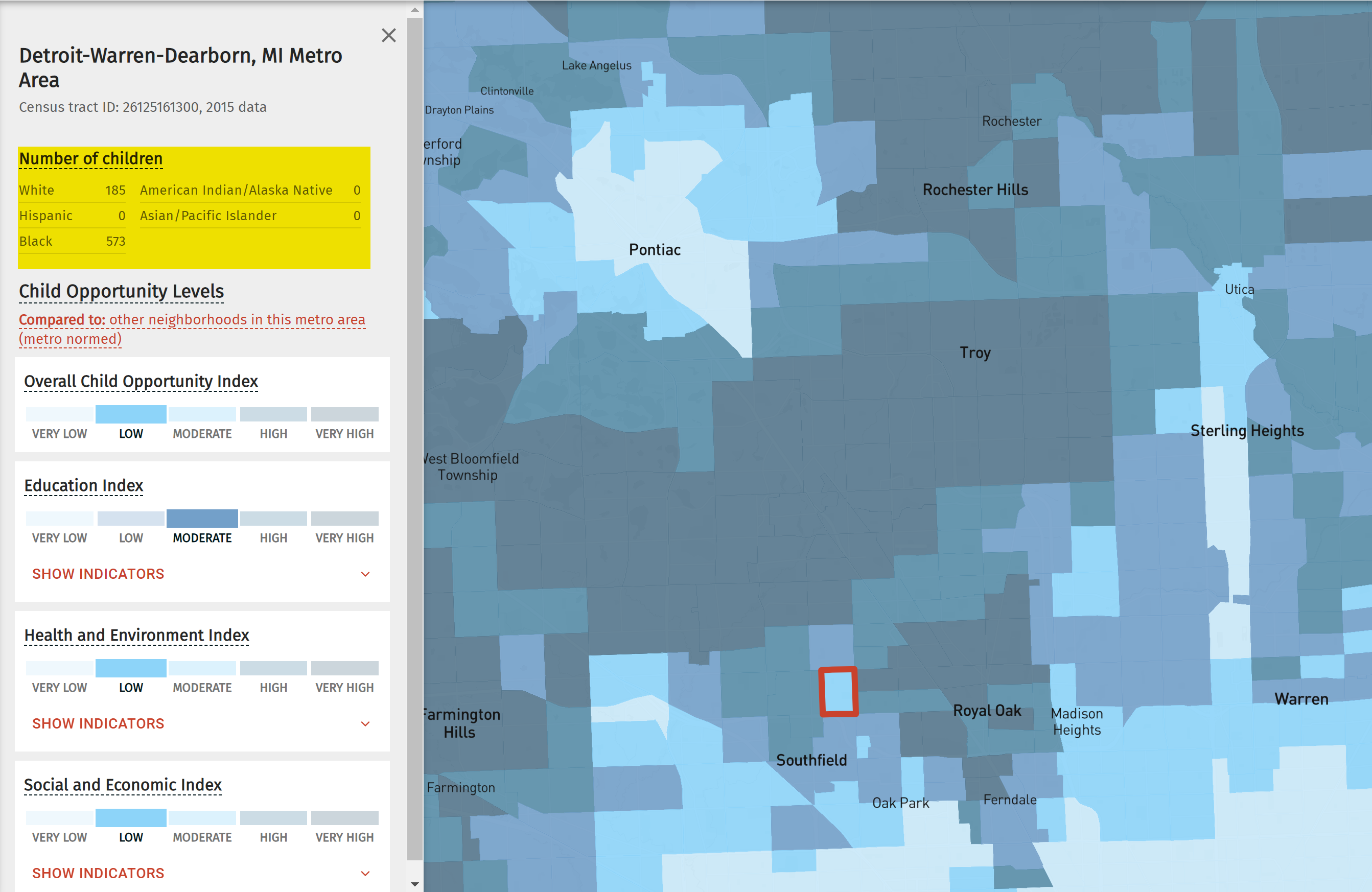
For each of 72,000 census tracts in the U.S. (virtually all of them), the COI provides 29 indicators of neighborhood conditions that children need for health and wellbeing. Click on a census tract to explore the individual indicators via the panel on the left. Indicators are divided into three sub-indices: Health and Environment, Education, and Social and Economic conditions. The child population by race and ethnicity for the selected census tract is shown at the top of the panel.
Look at change over time
The COI includes data for two time periods, 2010 and 2015, allowing users to visualize change over time. As communities and policymakers begin to build a more equitable post-pandemic recovery, COI data can provide a benchmark for measuring future progress.
Share a map
Create a map and then share it via social media, a URL or code that can be embedded on a website. The recipients of the shared link will see the map conditions exactly as you selected them.
We want to hear from you
We’re excited to share this new resource and look forward to hearing from you. Contact us with questions or feedback or tell us how you’re using the Child Opportunity Index to increase equity in your community.


